Currently browsing category

Graphics / Data Visualization / Maps

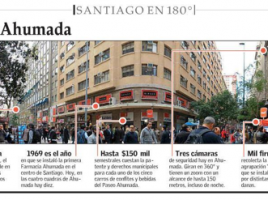
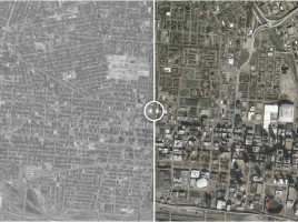
Cities transformed: then/now aerial photos

60 Years of Urban Change: Midwest – striking before and after aerial photos of nine midwestern cities show the profound effect highways and other land clearance projects of the mid-1950s have had in changing the texture of these downtowns over the last 50 years.  The Institute of Quality Communities at …

Two on China: Connected China app / China’s Urban Billions series

  Connected China: Explaining the Players and Networks within China – post on the always-interesting blog information aesthetics about a “beautifully crafted” app developed collaboratively by Thomson Reuters and Fathom Information Design.  Here’s a direct link to the Connected China app.   [It] tracks and visualizes the people, institutions and relationships that form China’s elite power …

Energy use in the U.S. (charts)

    Americans continue to use more renewable energy sources – press release from Lawrence Livermore National Laboratory about their 2012 flow chart of energy use in the U.S.  The “Rejected Energy” figure (upper right, in grey) has generated comment. Once again, wind power saw the highest gains, going from 1.17 …

Lego Architecture Studio designed by architects

  A Monochrome Lego Set To Teach Tomorrow’s Architects – six architectural firms contributed to the 268-page books that accompanies Lego Architecture Studio, a completely white set of Lego bricks designed to highlight major architectural principles.  Each of the firms – REX Architecture, Sou Fujimoto, SOM, MAD Architects, Tham & Videgård, and Safdie Architects – gets up to …

EPA’s map of renewable energy potential

    RE-Powering Mapper – the U.S. EPA recently updated its RE-Powering Mapper, a map-based tool showing renewable energy potential on 66,000 contaminated lands, landfills, and mine sites across the country. Features include: Screening results for over 66,000 sites for solar, wind, biomass, and geothermal energy Search options by renewable energy …

The Codes Project

  The Codes Project – website is “an anthology of the codes, laws and related documents that have created, or sought to create, particular urban forms.”  This project, funded by the National Endowment for the Arts, covers codes from “around the world, and from all time periods.” The Directory section …

Compare city characteristics using maps

                Prepare to Waste Your Day With This Fascinating City Comparison Tool – comparative mapping tool, Urban Observatory, was created by Richard Saul Wurman, geospatial firm Esri, and film company Radical Media.  Shown here are two maps showing land dedicated to commercial use in …

Brightworks, a school for project-based learning

  Stamen, Maps, and Brightworks – post on the Stamen Design blog about their visit to a school around the corner from them in San Francisco, Brightworks, “an exploratory school whose method is rooted in project-based learning.”  What a great coming together of cutting edge map designers at Stamen and young students …

U.S. flood trends and Smart Irrigation Month

  Our Flooded Future, According To FEMA – “By 2100, the area of the U.S. at risk for inundation will increase 45%. These maps–from the guys who are going to have to deal with it–show where.”     5 Strategies to Maximize Smart Irrigation Month – the five strategies in this …

Book-illustration-lovers delight

  BibliOdyssey – one of my favorite places to take a break; here’s the tag line:  Books~~Illustrations~~Science~~History~~Visual Materia Obscura~~Eclectic Bookart.  Each post features images based on a theme, or from a specific book or manuscript.  The images are wonderful and plentiful and unexpected.  Most sources are from early printed books or manuscripts …

3 for bicycle riders

The Atlantic Cities often covers how cities and urban areas around the world accommodate bicycle traffic.  Here are three recent posts:   10 Brilliant Pieces of Bike Infrastructure – examples, many with clips, from ten cities in Europe, China, and the U.S.   A Real-Time Bike-Share Map for the Entire World – …

3D mapping at here.stamen.com

  Announcing here.stamen.com – designers of maps and data visualizations at stamen design have been working with Nokia map data from Here.com to create shareable, embeddable WebGL 3D maps at here.stamen.com. A description of this early-release prototype: It uses 3D data from HERE for San Francisco, New York, London, and Berlin to …

Functional map of United States

    A ‘Whom Do You Hang With?’ Map of America – here’s a map that’s not drawn according to state boundaries but by transaction areas.  Based on the website Where’s George? which tracks the flow of dollar bills, Dirk Brockmann of Northwestern University devised this map. Deep blue means …

USAspending.gov

If you need to understand U.S. government spending, take a look at USAspending.gov.  The first thing you see after a search is a map that lets you know at a glance which states have the most funding for whatever it is you’re looking up.  For instance, here’s a search for …

Graph Words – visual thesaurus

  Graph Words: online thesaurus – if you’re visually oriented and either enjoy words or want to understand them better, try Graph Words.  It maps the various meanings associated with a word and color-codes them as nouns, adjectives, verbs, and adverbs.  Shown here is ‘design’ and related nouns and verbs. …

World cities – where’s the growth?

            The world’s economic center of gravity shifts – a post in McKinsey Quarterly’s Chart Focus newsletter about … 440 largely obscure urban areas that will account for close to 50 percent of expected global GDP growth between 2010 and 2025 McKinsey Quarterly has a …

Big data and the first organizational chart

Big data in the age of the telegraph – the original organizational chart developed in 1854 by David McCallum of the New York and Erie Railroad offers surprisingly current lessons for dealing with today’s ‘big data’ issues and the flow of information through an organization.  [To read this full McKinsey …

Chilean cities get panoramic treatment

Santiago’s biggest newspaper takes a visual approach to urban issues – the Santiago edition of newspaper El Mercurio started a series, Santiago en 180°, with panoramic photos of sections of the city annotated with information on traffic, nearby changes, history, etc. Though a simple project, by rethinking what’s newsworthy El Mercurio has …