John Kormeling’s up and down bridge
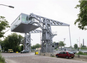
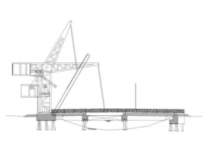
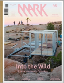
Up and down with John Kormeling – one-page article in Mark #46 (Oct/Nov 2013, page 32) about architect John Kormeling’s bridge in the Dutch city of Tilburg. It’s designed with a small building that serves as counterweight.
Kormeling designed the building as both bridge master’s house and cafe. ‘When I met the two bridge masters who work here, I noticed that both were very gregarious,’ he says. ‘One after another, people dropped in for a cup of coffee. The social atmosphere prompted me to integrate the bridge master’s house into the bridge itself and, at the same time, to make it a cafe. While they’re operating the bridge, they can earn a little extra money.’ ….
In addition to the counterweight, the bridge features another unconventional element. The architect has retracted the position of the hinge to some degree, thus elevating the deck much higher than is the case with traditional lift bridges. ‘Otherwise, when the bridge is open you’re faced with this broad grey wall,’ he says. ‘Now at least you have a nice view of the boats passing by while you wait.’
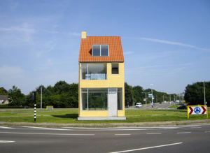
Part architect, part artist, Kormeling has a reputation for imaginative, ingenious, some would say zany, projects. Take, for instance, his Rotating House in a roundabout at one of the main entrances to Tilburg. It looks almost like a real house, but it makes a full circuit of the roundabout every 20 hours via wheels set into tracks. There’s a 47-second video clip of it in motion on his website (scroll down the left side):
… John Körmeling states that he wants to provide drivers waiting at the roundabout with a feeling of alienation from reality by having the house rotate.
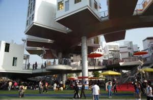
Another Kormeling design was the Dutch Pavilion at the 2010 Shanghai World Expo , called Happy Street. From Dezeen:
The Netherlands Pavilion, known as “Happy Street,” is constructed in a figure eight – a lucky number that suggests fortune in Chinese culture. It is mainly composed of a 400-meter pedestrian street that curves in a figure of eight and 26 small houses along the street. Built completely on stilts, the street looks like a suspended roller coaster.
If you can find an actual copy of Mark #46 (I found it in a library), there’s something interesting on almost every page – a small German “Autobahn church” by Schneider+Schumacher, the Jianamani Visitor Centre in Tibet by Atelier TeamMinus, modular student housing in Belgium by DMVA / A3, a longer look at Pioneertown in the California high desert with a series of projects tailored to that environment – off-grid houses by Taalman Koch Architecture and Isozaki-designed meditation pavilions (you can see the entire article here). There’s a piece on the Australian design firm Lyons (“We don’t want to be good; we just want to be interesting”), one on 3-D printing. I could go on, or you can take a look at ArchDaily’s description of the issue.

